Fitbit’s Ionic is the best Fitbit, but I wish it were more Pebble
by Miles Warren
October 03,2022
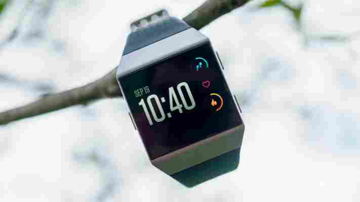
I’ve been wearing Fitbit’s new smartwatch, the Ionic , non-stop for about four days now. While I haven’t spent quite enough time for a full, comprehensive review of all its features and performance, one thing is already clear: The Ionic is Fitbit’s best tracker ever, but it’s also just barely a smartwatch – at least for now.

Some good news first: The Ionic looks much better in person than it does in renders. The matte metal finish and textured silicone strap make for an elegant contrast, and while the boxy shape isn’t to everyone’s tastes, the Apple Watch has done much to revive an appreciation for square-ish watches.
The watch is fairly slim and its clean lines meant I was surprised at how elegant the Ionic could look, especially paired with a leather strap. I still prefer circular watches, but I’m happy wearing the Ionic around all day, even with more formal attire.
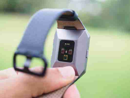
As a fitness tracker, it’s certainly the most complete Fitbit yet. Though I’ll have to test it for a while longer to be conclusive, Fitbit’s continuous heart rate tracking was on point every time I compared it to counting my own pulse. Most notably, it’s handled sharp heart rate spikes – such as when lifting heavy weights – with aplomb. Other trackers will sometimes give me a ridiculously high/low heart rate, or lose count altogether.
The display is easy to see even in mid-day sun, and the combination of touchscreen and clicky hardware buttons is easy to use on the go, and battery life has yet to die on me after wearing it four days in a row.


The Ionic comes with its own GPS, too. I don’t run often, and when I do I never leave my phone behind anyway, but I’m sure it performs well enough after having tested the Fitbit Surge. The watch is rated to 50 meters underwater, which is great news for swimmers, and a new SpO2 sensor is supposed to help track things like sleep apnea, but hasn’t been implemented yet.
That’s all well and good as a fitness tracker, but things start to fall apart as a smartwatch. The UI, while easy enough to use, feels a teensy sluggish – I imagine due to power optimizations to squeeze out battery life. Notifications are barebones, as you can preview them but not interact with them.
It also feels kind of sparse – less like a true smartwatch and more like a more like Fitbit Blaze Gen 2. The current app selection is paltry, even for a new smartwatch. Outside of Fibit’s own apps, you have Pandora, Strava (a fitness community), and… a Starbucks gift card app. It’s a little worrisome that Fitbit, with all its popularity, couldn’t find some more launch partners. The company is launching an SDK soon, but it will have to put in a lot of work to get developers to build up the app selection.
This is all a shame, considering Fitbit’s purchase and shuttering of Pebble earlier this year. While Pebble may have never reached the popularity it aspired, it had a small but dedicated community and a robust selection of useful apps. Moreover, Pebble’s OS felt far more polished than what Fitbit is currently offering. OS animations were buttery smooth, and the watches had voice capabilities, actionable notifications, and a super-clever timeline interface feature for viewing past notifications and future events in one place. Even the e-ink display seemed like a perfect fit for a fitness devices, thanks to the extended and easy daylight visibility.
If Fitbit had simply tacked its tracking abilities on PebbleOS with an E-ink display, it might have made my dream watch.
Granted, the Pebble team probably didn’t have all that much time to work on the Ionic, and I want to be clear it’s still a good gadget. At $300, it makes a solid case on fitness and design alone – and people will buy it anyway simply because it’s a Fitbit. And who knows, maybe the company will surprise me with a burst of developer support down the road. But right now, as a smartwatch, I can’t help but feel the Ionic is more of a tentative step forward than a grand leap into the fray.
