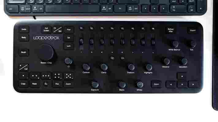
Review: Loupedeck cut my Lightroom editing time nearly in half
by Miles Warren
August 13,2022
When people hire a photographer, they usually don’t realize how much work goes into the editing process. If I spend eight hours shooting a wedding, it will often take me eighty hours to edit the photos.

Loupedeck, a hardware device that assigns physical controls to almost all of Lightroom’s editing functions, is designed to significantly reduce that editing time.
Unlike most competing devices that work with multiple apps, such as the modular Palette, the Loupedeck only works with Lightroom. It’s supremely niche, and $260 is a lot of money to pay for such an inflexible device.
But it’s that extreme niche that makes it so effective. For big jobs, it nearly cut my editing time in half. As they say, time is money.
The module is comprised of several controls mapped to almost every function you’ll regularly use in Lightroom. Image rotation is done via a giant knob, your usual exposure parameters are mapped to a bunch of smaller ones, and while a myriad of common functions have their own buttons.
I’m particularly fond of how individual colors get their own scroll wheels; I spend a significant portion of my editing time getting the colors just right.
There are also a few customizable buttons that allow extra flexibility – including summoning presets – and you can adjust knob sensitivity and custom functions in an easy-to-use companion app.
Ironically – and disappointingly, the worst thing about the Loupedeck is its hardware. It’s all plastic, and feels cheap. I don’t have a problem with plastic, mind you, but Loupedeck is using plastic that just doesn’t feel all that great to use, and the buttons are particularly flimsy.
To contrast, the Palette, with its metallic, modular design and arcade-like buttons makes me want to use it all the time.
That’s why it’s a good thing the Loupedeck actually works so well. I timed myself (roughly) toiling through a few big batches, and cut down my time by 30-40 percent when using the Loupedeck. Including the time it takes to curate the keepers , on average, it takes me a little under 2 minutes per photo using a mouse and keyboard. With the Loupedeck, it was about 1:20.
Considering I take somewhere around 2000-3000 photos for the average wedding shoot, that’s a lot of time saved. And I’d likely only get faster as muscle memory kicks in.
A big part of that is simply the intuition afforded by hardware controls. On a mouse and keyboard, adjustments are mostly done step by step. I’ll apply a preset, then I’ll adjust the exposure, then the white balance, then the skin tones, etc. At each step, I need to move my mouse to a tiny slider or remember the keyboard shortcut.
With the Loupedeck, I often found myself turning two knobs at once. I stopped thinking of editing photos in my typical numerical, premeditated fashion – this needs +0.5 exposure, -0.3 highlights – and simply turning a bunch of knobs until I got what looked best. Sometimes, a setting I wouldn’t have thought to use on a mouse and keyboard did the trick.
It’s worth reiterating: The Loupedeck is super niche. I wouldn’t recommend it to most amateur photographers, let alone most other people. $260 is alot of money to put down on such a product, and I’m not convinced everyone will see benefits over a mouse and keyboard alone. But if you photograph professionally and use Lightroom a lot, it really can cut down a huge chunk of your editing time. I just hope Loupedeck V2 comes with hardware to match its utility.
