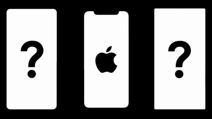
The iPhone X’s notch is ugly, but it’s a great marketing tool
by Miles Warren
August 25,2022
When it became clear that the iPhone X’s ‘bezel-less’ design would include a huge cutout at the top, people were… divided. “Steve Jobs” would have never allowed this to happen, some Apple fans decried, while others said it’s fair compromise compared to the chunkier bottom bezels on other phones.

But regardless of where you stand on the notch debate, one thing is becoming increasingly clear to me: it’s a great marketing tool. For better or worse, the notch makes the iPhone X instantly recognizable in a sea of ever-more-common “bezel-less” phones.
Nerdy as I am, I’m often curious about the devices the people around me are using – and New York City’s subway provides the perfect venue for random samples. I mean, it’s not like I’m staring at what people are doing on their phones, but when you test new phones every few weeks, you sometimes lose track of what everyday people are actually using.
Surprise: I’ve seen a ton of iPhone Xs in the past few weeks.
But it’s not just that I see people using iPhone Xs, it’s that I immediately know they are using iPhone Xs. That’s all because of the notch; It’s the one the thing that keeps the iPhone X from looking like any other glass and metal brick out there.
After all, many, if not most people put their phone in a case, so the only thing you can usually see is the screen. Smartphones already suffered from looking too similar to one another, and the ever increasing screen to body ratio gives designers even less room to play with. There are only so many ways you can design a screen on a rectangle, and the notch is one of few screens with any real visual flair.


I’ve seen Pixel 2 XLs, Galaxy S8’s and V30s in the wild, but even for an Android guy like me, it can take a second or two to identify a device at a distance. It’s unlikely an untrained eye will have any clue what devices the people around them are using without asking – they’re all just big rectangular screens.
Not so with the iPhone X. The notch is too in your face to ignore, and if you’ve seen an iPhone X — whether an ad or in person — you’ll immediately know what it looks like. If anything, it’s an even stronger visual cue than the iconic circular home button Apple maintained for ten years. It’s as much of an advertisement as the Apple logo itself.
I’ve overheard people asking strangers and friends “is that an iPhone X?” four or five times just going about my day in the city. Apple’s popularity aside, I don’t think think any of the bezel-less Android phone’s is unique enough to prompt the same interest. Well, except the Essential Phone , which beat Apple to the notch game, but that’s a relatively niche outlier.
You might be thinking that the notch is just a design compromise to accomodate Face ID, but while it may have started that way, it’s clear Apple is fully embracing its visual identity. Given the OLED screen, the company could have easily just hidden the notch from view by using a black bakdrop across the top of the screen, but Apple forbids developers from doing this in its design guidelines . Specifically, it says:
It also says not to directly call attention to the cutout, but it’s clear Apple wants you to notice the notch, and chances are it’s not going away anytime soon. It’s possible the company will try to shrink the notch in upcoming iPhones, but given developers already have to modify their apps to accommodate the new screen, my guess is that it will remain roughly similar for several years.
The notch may not be as seamless as we’ve come to expect from Apple’s designers, but put simply, it is unique. Considering Apple is a company that has built its reputation on its aesthetic identity, sometimes standing out takes precedence over everything else.
