The Pixel 2 has a crazy-good camera. Here’s how Google could make it better.
by Miles Warren
September 12,2022
The Pixel 2 (and Pixel 2 XL) has the best camera I’ve used in a smartphone, but it’s not perfect. After using the phones for about a month, I’ve found there are a few shortcomings Google could address in both its camera app and Google Photos that could make the shooting experience even better. While the company has to balance simplicity with features, most of these should be easy enough to address without bloating the camera.

The Pixel 2’s portrait mode is among the best I’ve used – all the more impressive because it works with a single sensor. But Google has made a few choices that limit its potential.
One that I personally find highly irksome is that Google forces the camera to crop images when using portrait mode – 1.5x on the rear camera, and 1.2x on the front. It may not seem like much, but it’s occasionally annoying enough to merit nitpicking.
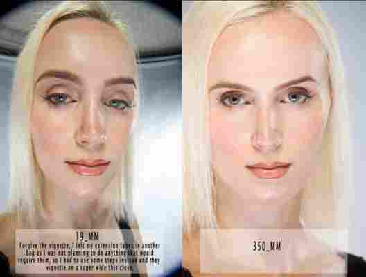
At first glance, the choice makes some sense. As you might know, portraits are generally more flattering when shot with telephoto (more ‘zoomed-in’) lenses because they force you to shoot from a distance. Shooting from afar reduces something called perspective distortion; see the below image for a dramatic example of how perspective distortion can affect faces.


The Pixel 2’s native focal length seems to be roughly equivalent to a 26-28mm lens on a full frame camera. With the 1.5x crop, it’s roughly equivalent to a 40mm lens. That’s not the most dramatic crop in the world – and still not enough to count as a telephoto lens – but it’s enough to be pretty annoying compared to other smartphones that let me do computational bokeh with a wide-angle camera. By forcing a crop, Google is:
Making it more difficult to take portraits in tight spaces, like a crowded restaurant
Effectively reducing the camera’s resolution
Magnifying artifacts like rough edges in the depth map and noise
Limiting artistic creativity, especially for non-portrait photos. Not every photo with shallow depth of field needs to be a portrait
The fact that Google doesn’t need two lenses to do portrait mode should be a creative advantage over not only devices like the iPhone X and Note 8, but professional cameras as well.
Even on a pro camera, getting substantial bokeh in wide-angle photos is something of a rarity; you need a wide-angle lens with a very high aperture – usually super expensive. In fact, wide-angle bokeh is one of the reasons super-high-end medium-format cameras are so appealing.
Computational photography should theoretically get around this problem by allowing you to ignore physics and apply as much bokeh as you want, so it’s a shame to see Google is limiting what should be one of its biggest advantages. If you’re not going to take advantage of the full field of view, you might as well introduce a secondary telephoto lens anyway.
My suggestion: When you enter portrait mode, Google should keep the crop on by default to encourage users to take a step back, but there should still be a way to accesss a wide angle view. You can already pinch-to-zoom within portrait mode, why not pinch-to-zoom back out? Alternatively, it could simply place a button in the viewfinder or even a toggle in settings.
Sometimes the Pixel 2 does too much bokeh. Other times it does too little. Though Google does save a non-bokeh-fied version of the image, I see no reason why it can’t provide an option to modify the overall amount of blur after an image has been shot. Samsung and Huawei already do so.
Side note: Wouldn’t it be great it some smartphone had a feature to let you tweak the depth map incase the algorithm gets it wrong? It could go a long way toward tidying up portraits with mottled edges.
Using portrait mode on the Pixel 2 comes with annoying caveat: each individual portait photo gets its own folder. While the Photos app hides this, finding a specific image is a pain using any traditional file management app, as you usually only see the folders rather the images inside.
On most other devices, portrait photos simply have a suffix in the filename; I don’t see why they need to be grouped in folders.
To access portrait mode on the Pixel 2, you need to first tap or to swipe access access the hamburger/left-hand menu, and then select Portrait mode. It’s a small thing, but every other device I’ve used simply has portrait mode right in the main camera interface.
Because it’s hidden by default, I sometimes forget it’s an option. As they say, out of sight, out of mind.
The Pixel 2 and Android Oreo introduce support for wide color gamuts, but almost none of Google’s own apps support the feature, defaulting to the sRGB color space. Now, there’s nothing wrong with sRGB, but out of all of Google’s apps, Photos is likely the one that would benefit the most from a wider selection of colors.
Of course, Google would also have to update the camera app so that images JPEGs are saved with the corresponding color space information too.
Google has the best HDR tech in the business, but sometimes the camera viewfinder doesn’t accurately represent what the final image will look like. Too often I’ve taken a photo with the Pixels camera only to find the final result looks different from the preview on screen. Thankfully, the final image is usually better than the preview, but sometimes it’s completely different. I find Samsung does a better job of this; it seemingly compiles the HDR image right in the viewfinder, showing a virtually identical preview before tapping the shutter button.
Even Google’s excellent HDR+ isn’t infallible. Unfortunately, there’s very little detail you can recover from JPEGs once highlights and shadows have clipped, but RAW gives you much more room to work with.
Lightroom CC recently added the ability to capture photos in RAW HDR, and while initial results aren’t always as good, its photos are much more amenable to pulling down highlights or brightening the shadows. Considering Google has given Photos some pretty advanced editing tools, RAW editing could be tremendously useful.
Now, this probably would take a lot processing power – Lightroom CC actually has to process RAW HDR in the cloud – but given the Pixel 2 has a hidden chip just for processing photos (which hasn’t even been activated yet), it might just be feasible. At the very least, I hope it comes to a future Pixel phone.
Not every photo I take is artsy. Sometimes I simply need to capture text or highlight information, but the Pixel 2 has no way to annotate or draw on photos or screenshots – something many skinned versions of Android allow, not to mention iOS. Not only is it not in Google Photos, it’s not even in Snapseed, which is Google’s more powerful image editing application.
Of course, there are third party apps that can do this, but the experience tends to be cumbersome. I don’t need anything fancy – something as simple as a red marker would in Google Photos would be tremendously useful.
Motion photos work surprisingly well on the Pixel 2, as I think Google does a great job of knowing when there’s something worth capturing with motion. Problem is, actually sharing them is a pain.
If you use the default share card, it’s not clear if Google will share the photo as a still image or video. And in any case, I’d much rather be able to send them as a GIF, which are easier to share and embed around the web.
While Google Photos does let you create an animation from at least three still images, for some reason, this doesn’t work with the obvious candidate of Motion Photos. Photos will sometimes automatically make GIFs from videos, but there’s no way to do so manually.
Google’s camera is good in part because of its simplicity, but it’s annoying when you need to download an extra app just for features commonly accessible on other devices, like direct-to-GIF captures and hyperlapse video. A simple solution would be for Google to allow camera add-ons like Samsung and Huawei do. That way you could add features to the camera without burdening users by default.
It’s clear Google wants to keep its camera as simple as possible, but a few additions could go a long way towards giving users more flexibility without cluttering the experience. Anything else you think Google should change?
